Project 1: Analysis of CO2 emissions (metric tons per capita) Around the World
- Will Chiappetta
- Sep 9, 2022
- 4 min read

Updated: Sep 30, 2022
Introduction to the Problem
Many people around the world are affected by increased CO2 emissions. Some countries are able to control the amount of CO2 they release into the atmosphere and others struggle immensely. I want to examine how different regions, and more specifically, which countries are releasing the most CO2 into the air per capita and whether emissions around the world are increasing or decreasing.
Introduce the Data
The data I used came from the World Bank which is a site that has many data banks regarding different statistics around the world. World Bank has a variety of data sets on all different types of topics about the world. I found my data set on Kaggle. This data set has information from each country from 1990 to 2019 on their CO2 emissions in metric tons per capita.
Pre-Processing the Data
I needed to clean a couple problems in the data before I could start using it. First, I wanted to drop all of the Na's and all the countries connected to them in my data set because if the country was missing all their data then they were not useful in the data set. Also, there was plenty of data from other countries to be able to formulate good analysis from the data. This left me with all useable data and now I was ready to clean up how the data was set up to make it easier to analyze. First, I created a new data frame and set each of the columns names for the data set, and then I stacked all of the years. Then I named the last column CO2 and the second to last column I labeled Years. Finally, I reset the indexes and then I had a sorted data frame. I found how to do this here.

Now I am ready to analyze the data!
Data Understanding/Visualization
After preparing all of my data I can start creating graphs from my data using Plotly Express. The first graph I made was a histogram to look at all the different regions in the data.

You can see from this histogram that Europe and Central Asia by far release the most CO2 in metric tons per capita. Also, it is easy to observe that the year with the most CO2(metric tons per capita) released was in 2009. In addition, in 2019 we have approximately the same amount released as we did in the mid 1900's. Now I want to examine several statistical values from the data frame to make some observations.

From this data I could see that there was an outlier in the data set because the max CO2(metric tons per capita) was much larger than the mean and way outside the standard deviation. Now I wanted to create a graph that would display what that outlier was. I created a strip chart to find out what that outlier is.

This graph is a little tight to observe, however you can note a few characteristics from it. The country that is clearly releasing the most CO2(metric tons per capita) is Qatar. In 2003 they released 50.95 metric tons of CO2 per capita. This is far greater than any other country. I did some research and found at this link that the reason they release the most CO2 per capita is because they are the largest producer of LIquified Natural Gas and they do not have a large population. In addition, you can observe that all of the countries including Qatar have started to decrease the amount of CO2 released in their country per capita. This is encouraging to discover that everyone has realized the effect of the large amounts of CO2 released on the atmosphere.
Next, I created a heat map for all the countries to display a clear visualization of who is releasing the most CO2 per capita.
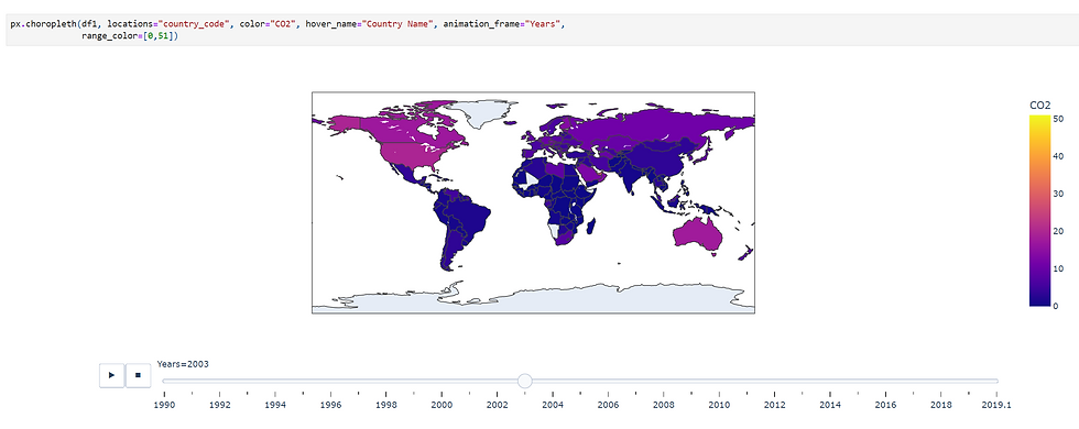
*I wasn't able to get the animation in this blog, but you should be able to access it from my code link at the bottom of the page.
This graph features a clear visualization of a heat map from all of the CO2(metric tons per capita) released by each county. If you look closely you will notice that Qatar is very yellow and is the only county that color. Qatar makes this graph not work as well, but is still a good visualization to understand which countries are releasing the most CO2(metric tons per capita). For example, you notice that the USA is a lot lighter than Mexico so the USA is releasing more CO2(metric tons per capita).
This next graph I created is an outline symbol map to see which areas are releasing large amounts of CO2(metric tons per capita).

*I was not able to get the animation in this blog, but you should be able to access it from my code link at the bottom of the page.
This graph does a good job showing which areas are releasing a large quantity of CO2(metric tons per capita). What you can observe easily from this graph is that there are many countries in Europe that are releasing good amount of CO2(metric tons per capita) into the atmosphere which adds up since all of them are next to each other.
Impact
There are many impacts on the world that can come from this information. The data is beneficial because you will be able to understand which regions and countries of the world are emitting the most CO2 per capita. Then you can focus on those countries and help them lower their carbon footprint. Some possible harms are if countries are forced to lower their CO2 emissions this could affect the world’s economy negatively and cause many other problems. Information that could be missing from the data are that some countries might not have data for their CO2 emissions on the data set.
Conclusion
My results have provided us with many insights. We have learned that countries have started to decrease the amount of CO2(metric tons per capita). This is a step in the right direction, however, we can still notice that some countries CO2(metric tons per capita) continues to be much higher than other countries. For example, the country that is releasing the most CO2(metric tons per capita), Qatar, is still way above the next closest country even though it is on a downward trend.
From this project I have learned how to better use Jupyter Notebook and create interesting visualizations. The visualizations are interactive and are very useful for analyzing data in a data frame. I am excited to learn more about Python and Data Science as this class continues.
References/Code
Code help: https://plotly.com/python/plotly-express/
My Code


Comments